Trying one more test. This is test number 4. Etiam a suscipit neque. Vestibulum eleifend elit non tortor malesuada euismod. Praesent in consectetur nunc
Trying one more test. This is test number 4. Etiam a suscipit neque. Vestibulum eleifend elit non tortor malesuada euismod. Praesent in consectetur nunc

Etiam a suscipit neque. Vestibulum eleifend elit non tortor malesuada euismod. Praesent in consectetur nunc
Donec viverra sodales tellus, tincidunt congue ipsum dictum eu. Vestibulum consequat, purus eu vestibulum fringilla, felis augue convallis neque, et efficitur mi mi ut erat. Aliquam suscipit libero orci, nec lobortis ipsum cursus nec. Nunc libero tellus, suscipit sed ligula id, tempus aliquam arcu. Mauris quis nulla vel nisi scelerisque placerat. Sed quis nisi vitae elit feugiat facilisis quis a neque. Morbi aliquet, nisi ac commodo finibus, massa nulla consequat ex, vel tempor tortor quam a lacus. Donec tincidunt magna a purus accumsan porta. Suspendisse a euismod neque, at pretium lacus. Aenean eget tortor vestibulum, dignissim leo in, fermentum ipsum. Suspendisse pellentesque justo at condimentum commodo.
Nam feugiat libero nisl, sit amet consequat ex semper a. Vestibulum ante ipsum primis in faucibus orci luctus et ultrices posuere cubilia curae; Class aptent taciti sociosqu ad litora torquent per conubia nostra, per inceptos himenaeos. Pellentesque venenatis sem in leo egestas, et commodo enim dapibus. Class aptent taciti sociosqu ad litora torquent per conubia nostra, per inceptos himenaeos. Integer massa neque, vestibulum et consectetur accumsan, interdum vel quam. Mauris tempus nec lectus quis accumsan. Morbi sodales ipsum semper commodo bibendum. Nulla urna leo, consequat at finibus tincidunt, finibus at mi. Sed sit amet libero sodales lorem bibendum feugiat quis molestie urna. Duis egestas tempor metus. In aliquam mi et risus bibendum ornare. Integer mi enim, consequat sed nisi pellentesque, ultricies molestie orci. Nunc vitae ipsum porta, molestie neque at, sagittis nunc.
Etiam a suscipit neque. Vestibulum eleifend elit non tortor malesuada euismod. Praesent in consectetur nunc. Praesent risus dui, elementum quis posuere et, dignissim id turpis. Vestibulum rutrum magna sed diam efficitur, quis mollis erat mollis. Vestibulum posuere, orci nec convallis finibus, tortor elit cursus metus, in ornare magna tellus et libero. Cras orci nibh, imperdiet vel rutrum in, lacinia sed ante.

Vivamus luctus est sit amet placerat dignissim. Duis vitae diam non magna vestibulum porta sit amet a lorem. Fusce sem lorem, aliquet non volutpat sed, pulvinar eget ante. Quisque ullamcorper nec neque et consequat. Pellentesque sit amet porttitor magna. Fusce eget risus dapibus, mattis nunc sit amet, malesuada nibh. Nulla ligula magna, elementum id pharetra et, fermentum et elit. Vivamus lacus arcu, maximus at malesuada eu, viverra nec elit. Sed eget lacus porttitor, rhoncus mi vestibulum, volutpat dui. Suspendisse eleifend viverra mattis. Nullam eu ligula et nisl vestibulum sagittis. In augue nulla, vestibulum vel pulvinar cursus, eleifend sed orci. Morbi semper sapien a sem mattis, nec interdum justo sollicitudin. Pellentesque sit amet vehicula orci.
Lorem ipsum dolor sit amet, consectetur adipiscing elit. Maecenas in augue aliquam, lacinia dolor quis, lobortis elit. Suspendisse ultricies gravida lorem, vitae porta leo elementum eu. In neque lectus, imperdiet ac pretium id, rhoncus et dui. Nullam gravida rutrum ligula, a hendrerit enim pharetra et. Proin ac eros vitae magna varius laoreet in ac mi. Suspendisse volutpat dapibus ornare. Aenean aliquet nec nisi nec iaculis. Fusce id interdum arcu, eu elementum quam. Integer quis eros sollicitudin, luctus diam vitae, feugiat risus. Suspendisse orci lorem, faucibus viverra tempor sit amet, pharetra et neque. Donec in nisi et eros vulputate convallis. Sed lobortis varius ex. Etiam bibendum congue nisl, in scelerisque urna aliquam at. Ut nec facilisis metus, nec gravida arcu. Donec efficitur velit magna, eget aliquam elit varius pulvinar.
Aliquam erat volutpat. Mauris est dolor, faucibus sed turpis non, maximus mollis quam. Suspendisse in metus accumsan, sollicitudin magna at, suscipit dui. Ut id nunc elementum, bibendum felis sodales, hendrerit ex. Aliquam tristique velit ac erat cursus sollicitudin. Praesent maximus lectus risus, vel porta leo gravida eget. Aliquam tellus justo, pretium non pellentesque ac, vulputate sed ligula. Vestibulum id dictum nulla. Ut nec porta nibh. Curabitur auctor massa vel risus rhoncus aliquam.

Welcome to WordPress. This is your first post. Edit or delete it, then start writing!
Welcome to image alignment! If you recognize this post, it is because these are blocks that have been converted from the classic Markup: Image Alignment post. The best way to demonstrate the ebb and flow of the various image positioning options is to nestle them snuggly among an ocean of words. Grab a paddle and let’s get started. Be sure to try it in RTL mode. Left should stay left and right should stay right for both reading directions.
On the topic of alignment, it should be noted that users can choose from the options of None, Left, Right, and Center. If the theme has added support for align wide, images can also be wide and full width. Be sure to test this page in RTL mode.
In addition, they also get the options of the image dimensions 25%, 50%, 75%, 100% or a set width and height.

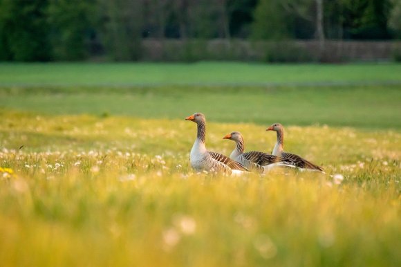
The image above happens to be centered.

The rest of this paragraph is filler for the sake of seeing the text wrap around the 150×150 image, which is left aligned.
As you can see the should be some space above, below, and to the right of the image. The text should not be creeping on the image. Creeping is just not right. Images need breathing room too. Let them speak like you words. Let them do their jobs without any hassle from the text. In about one more sentence here, we’ll see that the text moves from the right of the image down below the image in seamless transition. Again, letting the do it’s thang. Mission accomplished!
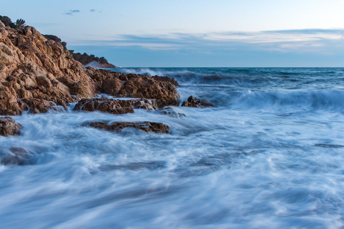
And now for a massively large image. It also has no alignment.

The image above, though 1200px wide, should not overflow the content area. It should remain contained with no visible disruption to the flow of content.

And now we’re going to shift things to the right align. Again, there should be plenty of room above, below, and to the left of the image. Just look at him there… Hey guy! Way to rock that right side. I don’t care what the left aligned image says, you look great. Don’t let anyone else tell you differently.
In just a bit here, you should see the text start to wrap below the right aligned image and settle in nicely. There should still be plenty of room and everything should be sitting pretty. Yeah… Just like that. It never felt so good to be right.
And just when you thought we were done, we’re going to do them all over again with captions!
The image above happens to be centered. The caption also has a link in it, just to see if it does anything funky.
The rest of this paragraph is filler for the sake of seeing the text wrap around the 150×150 image, which is left aligned.
As you can see the should be some space above, below, and to the right of the image. The text should not be creeping on the image. Creeping is just not right. Images need breathing room too. Let them speak like you words. Let them do their jobs without any hassle from the text. In about one more sentence here, we’ll see that the text moves from the right of the image down below the image in seamless transition. Again, letting the do it’s thang. Mission accomplished!
And now for a massively large image. It also has no alignment.
The image above, though 1200px wide, should not overflow the content area. It should remain contained with no visible disruption to the flow of content.
And now we’re going to shift things to the right align. Again, there should be plenty of room above, below, and to the left of the image. Just look at him there… Hey guy! Way to rock that right side. I don’t care what the left aligned image says, you look great. Don’t let anyone else tell you differently.
In just a bit here, you should see the text start to wrap below the right aligned image and settle in nicely. There should still be plenty of room and everything should be sitting pretty. Yeah… Just like that. It never felt so good to be right.
Imagine that we would find a use for the extra wide image! This image has the wide width alignment:
Can we go bigger? This image has the full width alignment:
And that’s a wrap, yo! You survived the tumultuous waters of alignment. Image alignment achievement unlocked! One last thing: The last item in this post’s content is a thumbnail floated right. Make sure any elements after the content are clearing properly.

Button blocks are not semantically buttons, but links inside a styled div.
If you do not add a link, a link tag without an anchor will be used.
Check to make sure that the text wraps correctly when the button has more than one line of text, and when it is extra long.
Buttons have three styles:
If the theme has a custom color palette, test that background color and text color settings work correctly.
Now lets test how buttons display together with large texts.
Lorem ipsum dolor sit amet, consectetuer adipiscing elit. Donec mollis. Quisque convallis libero in sapien pharetra tincidunt. Aliquam elit ante, malesuada id, tempor eu, gravida id, odio.
Maecenas suscipit, risus et eleifend imperdiet, nisi orci ullamcorper massa, et adipiscing orci velit quis magna. Praesent sit amet ligula id orci venenatis auctor. Phasellus porttitor, metus non tincidunt dapibus, orci pede pretium neque, sit amet adipiscing ipsum lectus et libero. Aenean bibendum. Curabitur mattis quam id urna.
Vivamus dui. Donec nonummy lacinia lorem. Cras risus arcu, sodales ac, ultrices ac, mollis quis, justo. Sed a libero. Quisque risus erat, posuere at, tristique non, lacinia quis, eros.
This is a left aligned cover block with a background image.
The cover block lets you add text on top of images or videos.
This blocktype has several alignment options, and you can also align or center the text inside the block.
The background image can be fixed and you can change its opacity and add an overlay color.
Make sure that the text wraps correctly over the image, and that text markup and alignments are working.
The next image should have a pink overlay color, the text should be bold and aligned to the left:
A center aligned cover image block, with a left aligned text.
This is a full width cover block with a fixed background image with a 20% opacity.
Make sure that all the text is readable.
Our last cover image block has a wide width.
This is a wide cover block with a video background.
Compare the video and image blocks.
This block is centered.
The block below has no alignment, and the text is a link. Overlay colors must also work with video backgrounds.
Gallery blocks have two settings: the number of columns, and whether or not images should be cropped. The default number of columns is three, and the maximum number of columns is eight.
Below is a three column gallery at full width, with cropped images.


Some more text for taking up space.
A two column gallery, aligned to the left, linked to media file.
In the editor, the image captions can be edited directly by clicking on the text.
If the number of images cannot be divided into the number of columns you have selected, the default is to have the last image(s) automatically stretch to the width of your gallery.
A four column gallery with a wide width:


A five column gallery with normal images:


This is the same gallery, but with cropped images.
Six columns: does it work at all window sizes?


Seven columns: how does this look on a narrow window?


Eight columns: